creative
studio.
Ostra takes its name from the oyster, a small but mighty creature. Oysters filter water and restore ecosystems, turning grit into something beautiful. I do something similar with ideas, taking what’s raw and shaping it into visuals that tell a cohesive story.
work.
styling
As a long time photographer and interior designer, I style for the photo frame, what’s intended to be seen.
convening
A variety of creatives coming together to share in philosophy and practice, leaving with new perspectives & community.
creative direction
Honest, artistic visual storytelling for brands that insist on doing things differently.
clients.
bea
olive oil
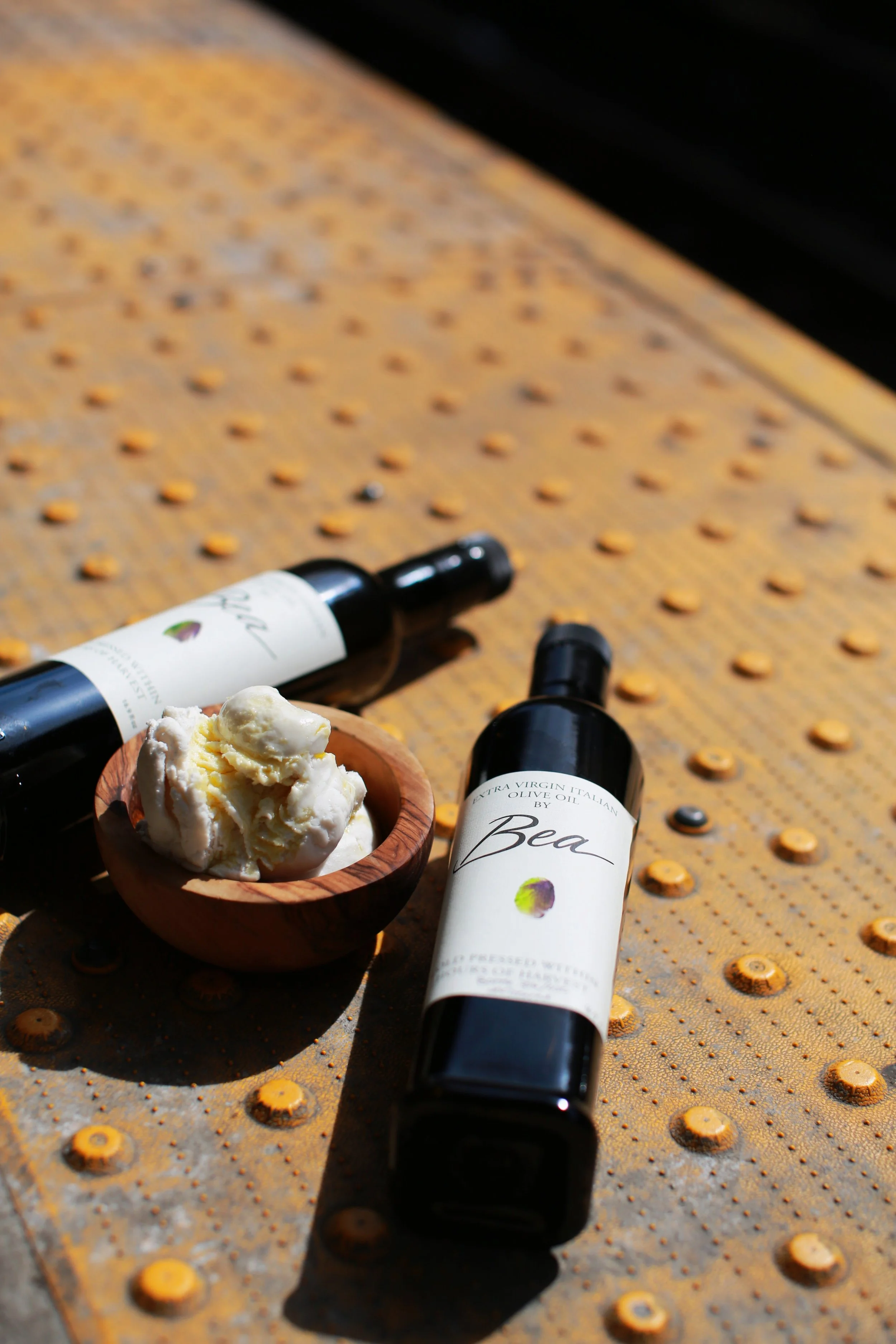
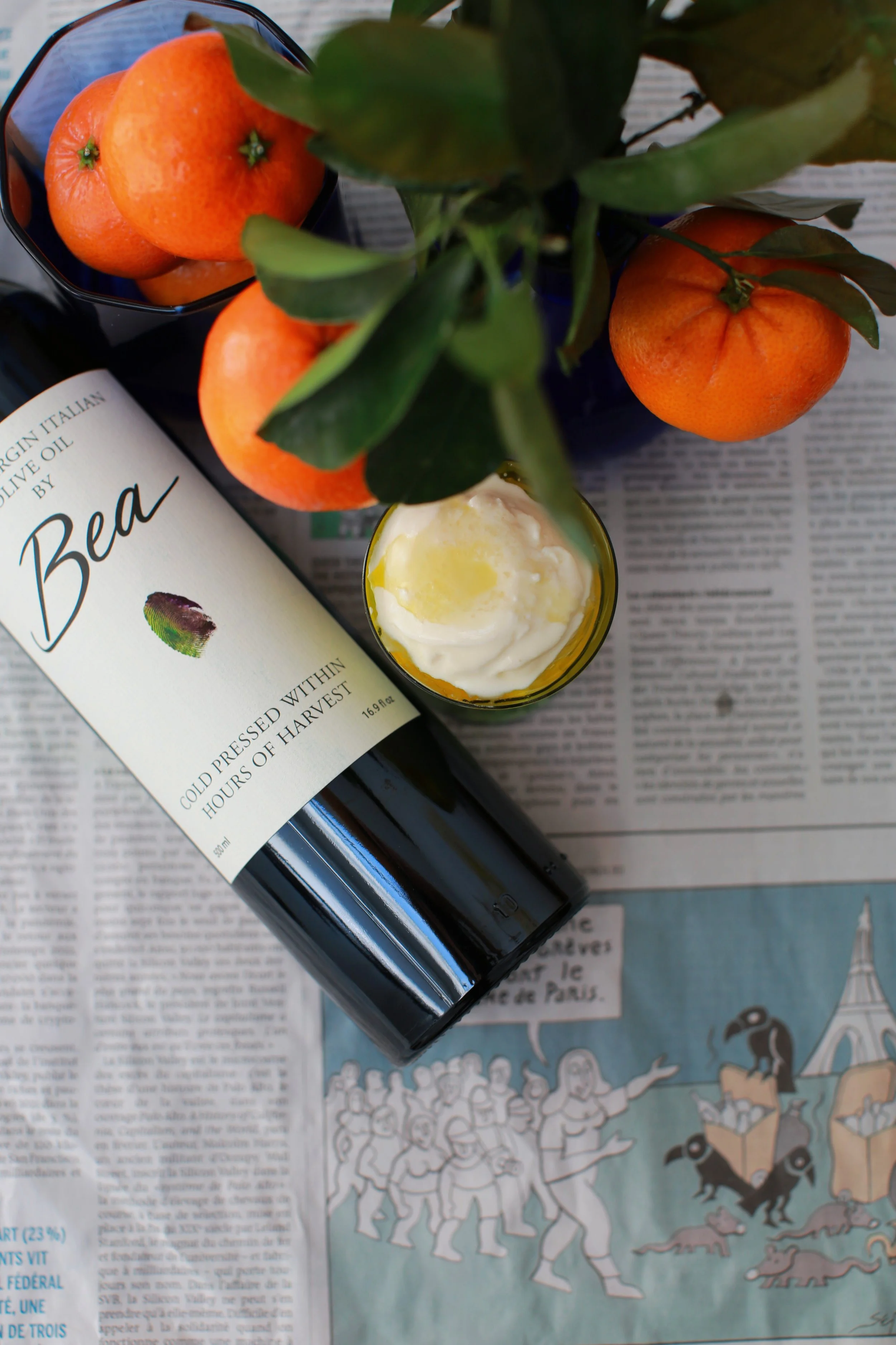
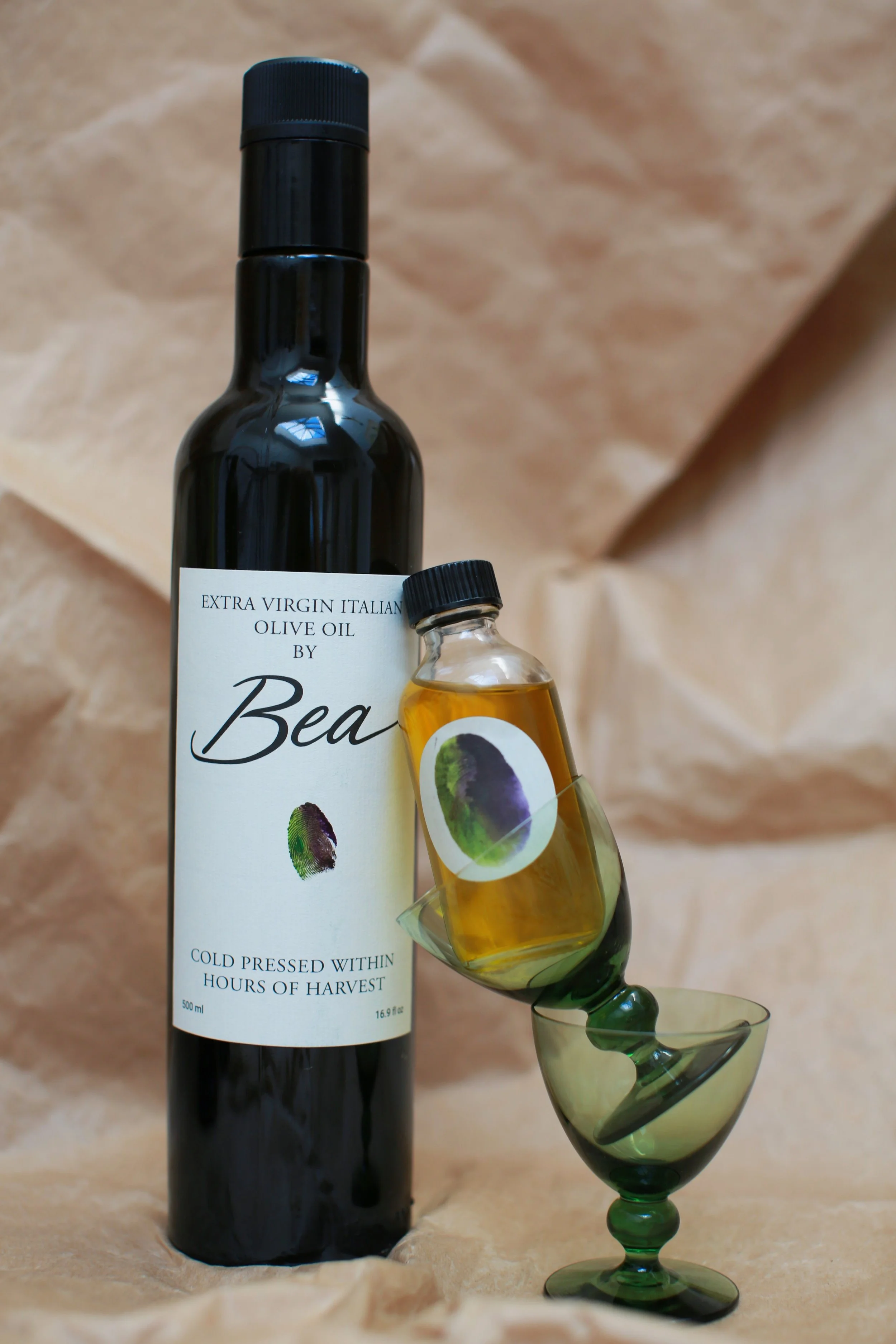
Bea Olive Oil marked my first foray into product styling. I set out to fuse its deep Tuscan roots with the edge of its New York sales address, bringing it to the iconic B subway line, drizzled over vanilla ice cream with salt, just as the Tuscans would do.
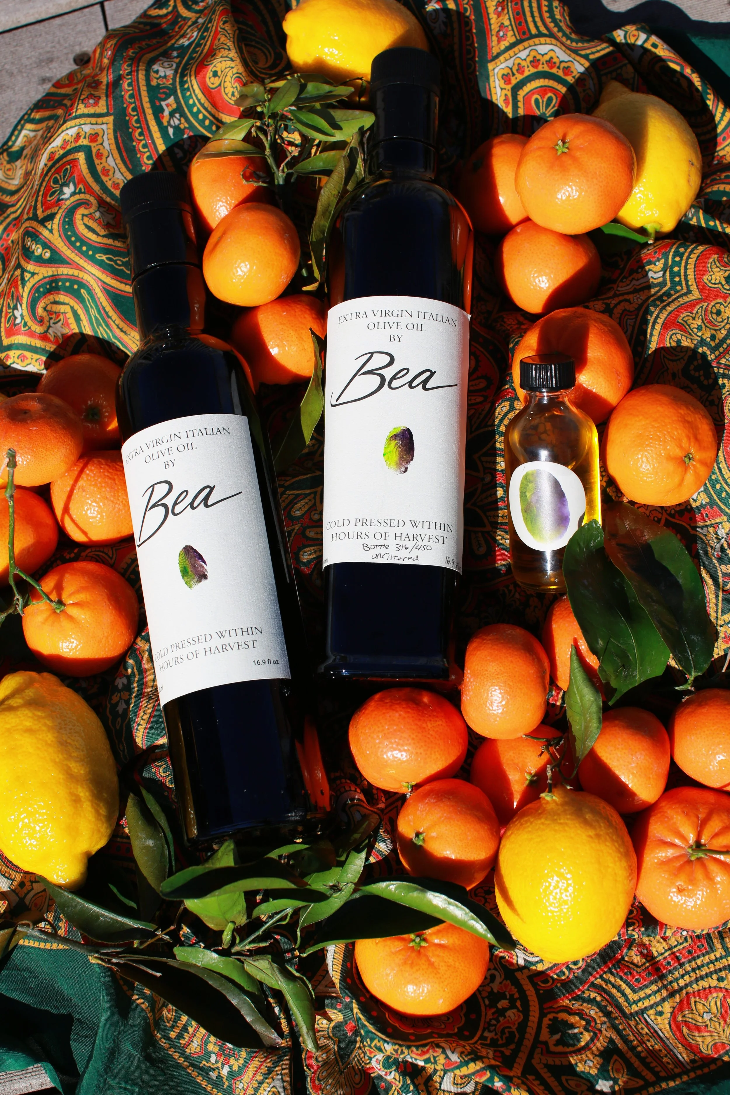
This high-quality olive oil owes its vibrant green hue to early harvesting, when the olives are still young. I highlighted this unique characteristic by surrounding it with an equally vivid palette, and letting color tell the story of its freshness.
uptown
entertainment
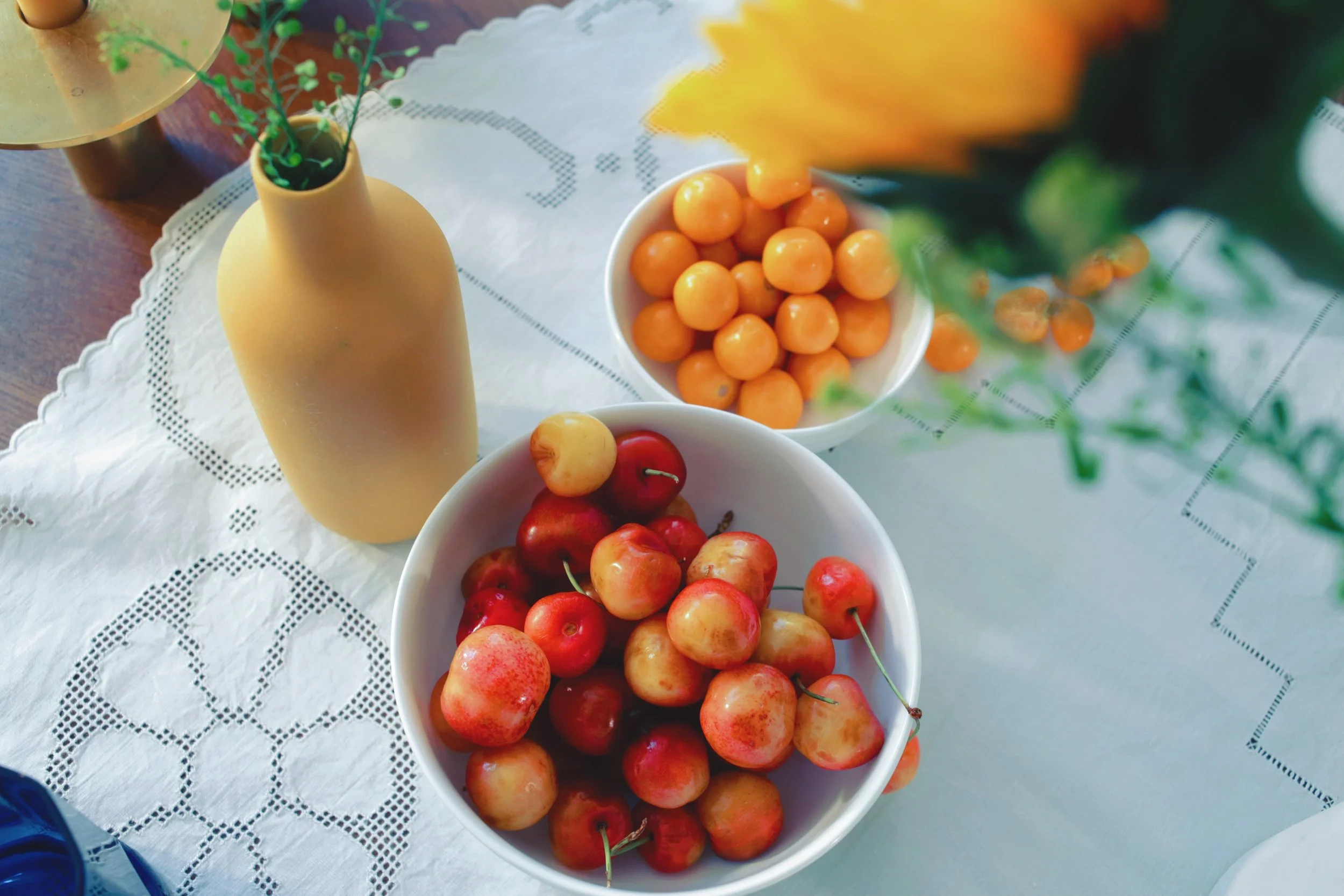
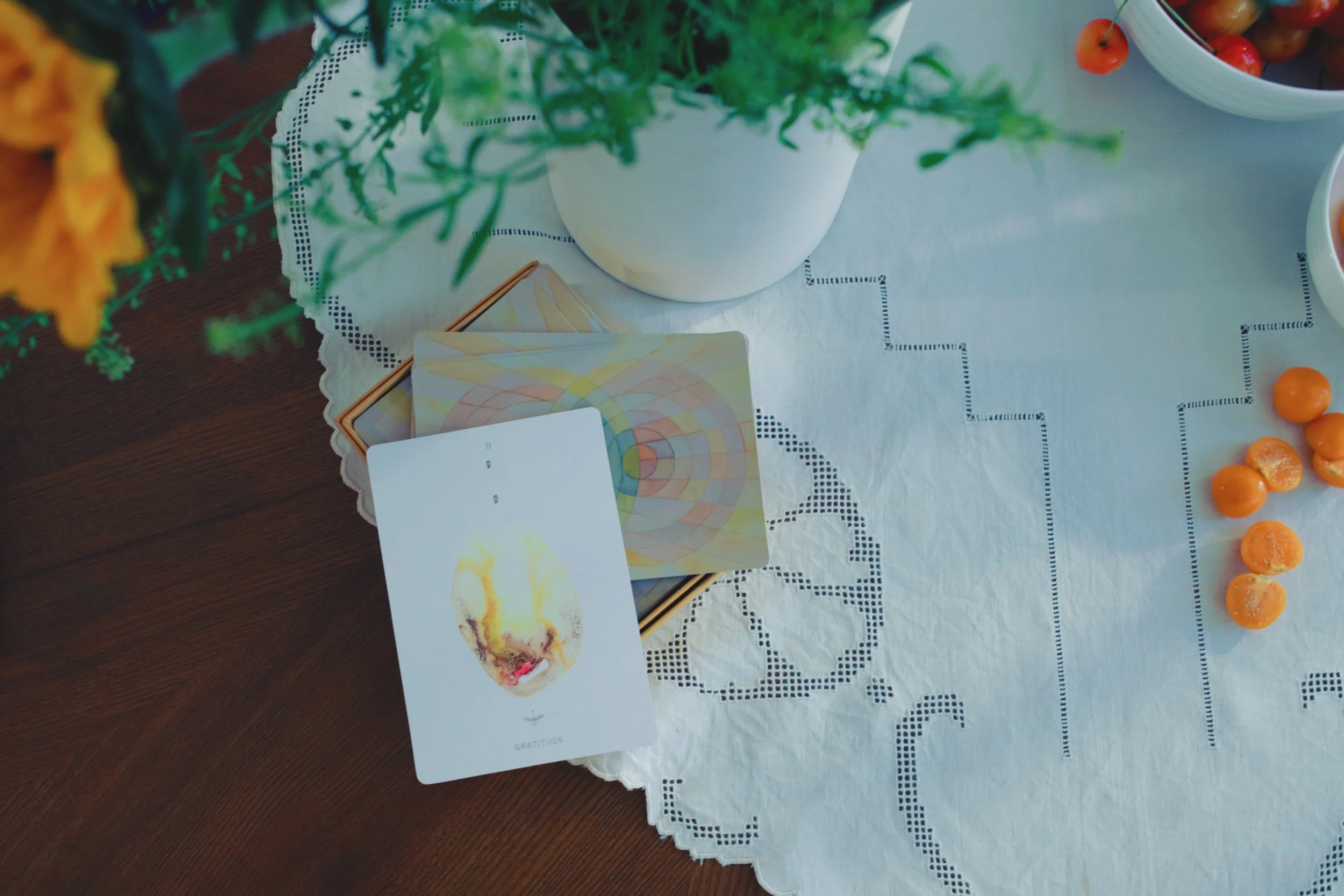
My client made plans to entertain but wasn’t equipped with the tablewares to create a warm, welcoming environment for his guests. I set the table with an abundance of colorful fruits and cobalt blue glassware, letting the serveware remain subdued. Tarot cards littered the table and a polaroid camera made its appearance known—always the star of the show.
